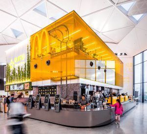
 The iconic golden arches are always going to catch your eye. But the new McDonald’s at Sydney International Airport’s Terminal 1, a glowing yellow glazed kitchen set high above the eating area, is one for the books.
Working closely with the team of designers and strategic thinkers from Landini Associates, McDonald’s Australia is giving fans of its world-famous quick service brand a totally new experience. The restaurant’s vertical design maximizes its airport footprint while also providing a peek into how the magic is made; a feast for the eyes.
We caught up with Mark Landini, Creative Director at Landini Associates, to get his thoughts on how McDonald’s newest flagship model is helping set the tone for the brand’s presence around the world.
Give us a snapshot of the brand.
McDonald’s is the world’s largest, and arguably most iconic restaurant brand, with tens of thousands of locations globally. Landini is proud to be part of the ongoing evolution of the McDonald’s brand and creator of a new international flagship model, Project Ray, whose designs helps enunciate McDonald’s continuing leadership and core values of innovation.
 What type of consumer are you targeting?
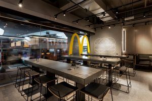
The initiative was to challenge Millennials’ expectations of the brand. In response, Landini Associates and McDonalds created Project Ray, which initially launched in December 2015 at Admiralty Station in Hong Kong. It has since rolled out internationally and continues to do so. Landini Associates’ scope of work included the complete reinvention of the international restaurant chain, including brand positioning and master planning, architecture and interior design, graphics, packaging, work wear, and design standards and guidelines for roll out.
How does the design of the restaurant cater to what today’s consumers are looking for?
In a world where everything is getting increasingly chaotic, it’s time to be quiet and let the food and services do the talking. As such, Project Ray is an exercise in simplicity. It is designed to be a place of respite from the noise of today’s urban life. The energetic environments that have been the signature for McDonald’s are now replaced with a simpler, calmer and more classic feel.
What are some of the adjustments you made to your business model surrounding the recent state of events?
Meeting today’s challenges required that Landini Associates looked beyond McDonald’s established norms and “reinvent normal” — that is to take time to reconsider what went before and sometimes start anew—to appeal to a like minded, sometimes younger, but always broad audience.
What kind of conversations are you having with your customers?
We conceived Project Ray to be a “holistic toolkit of parts” that can be fine-tuned by location and customer profile. Understanding these differences allow the furniture, balance of materials and layouts to be adjusted accordingly. Finishes like concrete, glass, stainless steel and oak form a palette of stylish simplicity. They create a backdrop of recognizable neutrality, promoting the service, product and people who come to enjoy it. Mix these ingredients one way to tell an urban story, then another to localize it.
 Walk us through how and why the restaurants are designed the way they are?
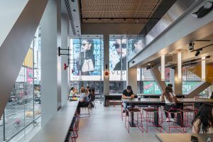
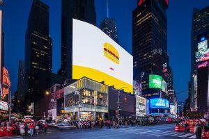
The Times Square location in New York offers a good example of how our design process works in practice, giving back space to the food and service.
It doesn’t get more “bustling” than Times Square, so behind a new three-story glass facade we created a calming interior that provides a number of vantage points onto the vibrant NYC streets below. We toned down the visual color that is typical to the FSR category, in favor of abstracted oversized yet minimal wall treatments that nod to the heritage of McDonald’s iconic products and golden arches.
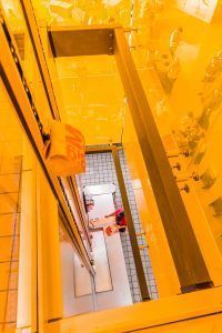
A number of different seating options and a self-order kiosk system enhance functionality and allow for a variety of different guest experiences, all realized with the Project Ray material palette of concrete, glass, metal and oak. Another Landini innovation is the yellow staircase that injects vibrancy and visually connects all three levels. The design is instantly recognizable as a McDonald’s, and it’s also recognizable as a unique New York restaurant. This ability to create an exceptional experience for customers is the heart of the “why” behind the Project Ray design approach.
It also doesn’t harm to mention that the restaurant design won a Gold award at the 2019 NYC Design Awards for Best Interior Hospitality Project.
Other awards include:
2019 Retail Design Institute of America
Class of 2019 (Best Designs Globally in 2019)
Project: McDonald’s Times Square
2019 Retail Design Institute of America
Innovation: Branding
Project: McDonald’s Times Square
2019 Retail Design Institute of America
Innovation: Digital Integration
Project: McDonald’s Times Square
 Give us a rundown of your market’s layout.
Landini Associates has designed McDonald’s global flagships in Chicago, including both the McDonald’s Headquarters Global Menu Restaurant and the famous Rock n’ Roll Restaurant, New York’s Times Square, San Francisco, London’s Oxford Street, Madrid, Milan, Poland, Buenos Aires, Seoul, Hong Kong, Shanghai, Beijing, Dubai, Tokyo, Singapore, Sydney, Brisbane and, most recently, Moscow. These are just a few flagships representing many hundreds of locations that Project Ray has rolled out to across the world.
Regardless of the sector, in all our projects, Landini Associates works with decision-makers in customer-facing businesses, from retail and hospitality, to property development or a service industry. The firm’s work is always strategically driven, but creatively led, and we are equally at ease inventing new brands as we are evolving and redefining existing ones
What’s the biggest issue today related to the construction side of the business?
The growth of the internet and the online environment has radically reinvented the way we live and the services we are offered. Disruptive businesses such as Uber, Air BnB, Netflix and Amazon are now the norm—one that is constantly being reinvented. We believe this needs to happen offline, too, and so throughout all our projects we strive to “reinvent normal”—to question and break down what doesn’t work and find new, unanticipated and memorable solutions.
Talk about sustainability. What are you doing?
We believe that low embodied energy is one of the main ways designers can have a realistic input into sustainability. These days, there’s so much trend-washed talk about “sustainable” design without any real consideration of what this means in relation to the longevity of a design. Sustainable to us means designing places that don’t get thrown away or disposed of—places that can truly become a part of the community in which they serve and evolve with it.
We’ve always preferred the classic over the fashionable and consider embedded energy in all of our projects. As such, most, if not all, of our work far outlives the market norm. In fact, our studio’s founding project, Awaba Café, on Sydney’s Balmoral Beach, remains completely unchanged in design to this day—28 years later.
In today’s complicated landscape, what type of opportunities do you see moving ahead?
Moving forward, more than ever, businesses need to be brave. Not being brave is the same thing as being stupid. Be bold, be brave, and if you can’t, just make sure you’re not boring. Everything is changing at such speed that any form of complacency can lead to disaster if you’re not agile enough. Just because something worked 10,000 days ago doesn’t mean it will today—least that’s what online has taught us and recognizes. The opportunity and challenge therefore is to “Reinvent Normal.” What this looks like is up for grabs.
 Are you optimistic about how the marketplace has responded?
Entirely. Project Ray has been so successful that it has been sought out by multiple territories globally as the go-to flagship store model, and iterations of our design concept have since rolled out internationally. It has also been honored with design awards across the world and featured in an endless array of design and arts magazines and books. In Australia, The Sydney International Airport’s Mc-Donald’s was named as one of Australia’s Top 35 restaurant designs by Vogue Magazine. No mean feat for a quick service restaurant.
But the most important and rewarding response is that of the customers. Sydney Airport’s GM of retail, Glyn Williams, said that McDonald’s at Terminal 1 has become, “The most Instagrammed place at Sydney Airport. People have started arriving early for their flights just to see it.” In fact, the design has been so popular that FRAME Magazine recently declared it “broke the internet” and created a new Social Media Award in its honor.
What’s your growth plan?
Since it launched in December 2015, Project Ray has rolled out across Australia, Asia, the UAE, Europe and America. It continues to roll out internationally.
What trends are you seeing?
We don’t follow trends and we don’t design for them either. Rather, we strive throughout all our projects to challenge the norm, invent something new and memorable, and “Reinvent Normal.” This is a process by which everything is questioned, broken down and, if need be, discarded. It is simply a way of examining whether a norm or a starting point makes any sense. What results is the reinvention of the vernacular of any category that we are working in. Sometimes, this requires bravery, other times, just the application of common sense.
What’s the secret to creating a “must visit” restaurant environment in today’s competitive landscape?
We live in a constantly changing world. There are fewer constants than ever before. But food is, and can be, one of these. Eating is a fundamental human interaction. A place of commune where we behave as we have for millennia. We need a visually quiet place to do this so we can hear each other talk, laugh, argue and cry. Creating simple places and spaces is much harder than creating loud and fashionable ones, creating memorable simple spaces is harder still. Project Ray stands out amongst its competitors because it overcomes the challenge of creating a quiet, neutral, classic space that is memorable, too.
So, the “secret” is simple: Hero the food, the service and the people who have come to enjoy it; and create a recognizable neutrality that allows this to happen.
What’s today’s consumer looking for in a restaurant? Tell us what makes your brand so unique?
Customers are looking for restaurants that provide a calm respite from the non-stop action of the modern world—a place where they can enjoy food with friends or in solitude, but always in peace. They’re also looking for brands that are defined by their real and enduring personalities as opposed to artificial ones.
We have become globally renowned for our work in hospitality because we challenge everything, refuse to follow trends and aren’t afraid to ask “dumb” questions. That is, we “Reinvent Normal” by combining information, lateral thinking, practicality and originality. We always strive for innovation, but not for innovation’s sake. Design is a cognitive exercise, and so the inspiration has to come from recognizing the issue, the opportunity or sometimes the problem. Style is an important element, but only a small part.
Story by Michael J. Pallerino, editor of Commercial Construction & Renovation magazine. Over the past 30-plus years, he has won numerous awards, including the “Jesse H. Neal Editorial Achievement Award,” recognized as the Pulitzer Prize for business-to-business magazines. He can be reached at mikep@ccr-mag.com.
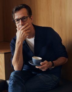
One-on-One with Rikki and Mark Landini
What’s the biggest item on your to-do list?
It is to make great coffee. That’s how we start our day. We have been experimenting with a new ALDI product (one of our clients), which has just won Canstar’s latest “Most Satisfied Customer Awards” for the best coffee in Australia by Australian consumers. Coffee is a big deal here, so this award is incredible—so is the coffee, by the way. More than 10 of the most popular brands in Australia were rated on taste, aroma, texture, packaging, variety, value for money and overall satisfaction. And the brand to come out on top is ALDI’s very own Lazzio coffee, which took the title of “Best Coffee” (beans and ground coffee).
What’s the most rewarding part of your job?
Design is just one part of a retailer’s appeal, but customers buy products, not design, so it’s rewarding to work with a business that is so product focused and innovative. No amount of design can affect that.
What’s the best advice you ever received?
To ignore fashion and invent, to glance left and right, but look forward; to think laterally, challenge everything, but keep it simple, and remember our clients are not our clients, but our client’s customers and team.
What’s the best thing a customer ever said to you?
At the end of the day, design is for people, and so we design places for people to make their lives better, more fun and fulfilling. Do this and you get responses like: “Maple Leaf Gardens by Loblaws has significantly improved my standard of living,” customer via Twitter.
Now that’s rewarding.


