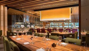
 Located at the Four Seasons Hotel, nestled in the heart of Boston’s Back Bay neighborhood, sits the 12th addition of Noriyoshi Muramatsu’s international collection of Japanese informal dining. Zuma, the izakaya-style concept, features the very best in Japanese delicacy, compliments of the founder of Tokyo-based Studio Glitt.
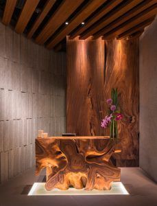
Architects Dyer Brown worked with Studio Glitt on the restaurant, which features a main dining room that offers a full view of three open kitchens, including the principal kitchen, and sushi and robata counter. At Zuma, diners are treated to the action, as chefs prepare dishes over Japanese charcoal. In addition, Zuma’s bar and lounge area feature a unique floating DJ booth made from one piece of monkey pod wood.
Part of the beauty of Zuma is that the design team was able to bring a sophisticated level of design to the city’s third tallest skyscraper, ensuring that the 7,000 square foot eatery venue lives up to its globally recognized name. Each of Muramatsu’s Zuma masterpieces stay true to the restaurant’s global aesthetic inspired by the four elements of earth, fire, water and air. While embodying the style and elegance of Zuma’s 11 other locations worldwide, the design incorporates unique commercial kitchen features.
We sat down with Kasumi Humphries, Senior Interior Designer at Dyer Brown Architects, to get a snapshot on the new Zuma restaurant concept at the Four Seasons hotel.
 Give us a snapshot of the design concept.
Overall, the Zuma concept is a sophisticated twist on the izakaya, a kind of informal Japanese pub. The traditional and contemporary menu items are inspired by the four elements of earth, fire, water and air. The design concept takes its cues from this idea as well.
The space dominated by granite walls and slabs of exotic monkey pod wood is sourced from Thailand. Additional interior accents include full-height rice paper accent walls with vibrant red and purple jewel tones.
As for the restaurant and kitchen layout, Zuma’s cuisine is prepared in three separate open kitchens: a main kitchen, a sushi bar and the signature robata charcoal grill. Overall, the approximately 8,000 square foot restaurant features 176 seats.
How does the design of the restaurant cater to what today’s consumers are looking for?
The approach to the cuisine is authentic, but not necessarily traditional. The design reflects this by blending traditional and contemporary elements of Japanese culture. Each location’s design is somewhat distinct from the others. Studio Glitt, along with chef and founder Rainer Becker, wanted the design to be informed by the location and the city, the energy, the culture and the clientele.
The design for Zuma Boston has elements in common with the others. The high level of quality is consistent across all locations, and all of them have the three open kitchens, but the Boston design is distinct in certain ways.
What are some of the adjustments you made to your business model surrounding the recent state of events?
Zuma Boston incorporates the best of recent trends in restaurant design technology to better serve the guests and support the staff. Primarily, those trends reflect a growing emphasis on health and wellbeing, influencing the specification of lighting fixtures and ventilation equipment, among other areas.
 Walk us through how and why the restaurants are designed the way they are?
Both the traditional and contemporary menu items are inspired by the four elements of earth, fire, water and air. The design concept takes its cues from this idea as well.
The design features massive monkey-pod wood slabs and spectacular granite boulders, all imported from Thailand and integrated with sophistication into an environment of custom-made Japanese paper walls, traditional purple and red hues, and floor-to-ceiling bamboo lanterns. The lighting is integrated seamlessly into the design to provide illumination without the guests ever noticing the fixtures themselves.
What’s the biggest issue today related to the construction side of the business?
There were enormous challenges, most of which were the result of working in a tight space in a skyscraper that was still under construction. One of the biggest challenges was bringing in and installing the “floating” DJ booth, which is actually a massive 12-foot-long monkey pod tree trunk. Installing it so that it appears to float was simple enough, but getting the tree inside the building required cutting it in half, and that meant it had to be reassembled inside.
What trends are you seeing?
Izakaya-style dining is itself a recent trend, which still is growing in popularity. For Zuma Boston, we focused on delivering a space that supported the signature Zuma worldwide concept, with some unique elements that reflect the location in Boston’s pulsating Back Bay neighborhood.
But in terms of the technology used in the design, we incorporated the best of recent trends in restaurant design technology to better serve the guests and support the staff. Primarily those trends represent the desire for health and wellbeing: good lighting and appropriate ventilation for comfort, for example.
 What’s the secret to creating a “must visit” restaurant environment in today’s competitive landscape?
You can see it in Zuma—sophisticated, intimate and exquisite. The tables evoke the exotic monkey pod wood color and finish and, in some cases, are actually monkey pod slab. The seating is chic and sophisticated, mirroring the jewel tone color palette.
The lighting is integrated seamlessly into the design, with the goal of providing illumination without the guests ever noticing the fixtures and luminaires themselves.
What was one of the more unique aspects of the design?
To help achieve Studio Glitt’s signature design for Zuma, Dyer Brown sourced porcelain ceramic tiles for the flooring, as well as glass, wood paneling, wood veneer and granite tile for the walls. Many such elements are large format, including the slab granite from Thailand, the wood veneer, and full-height Japanese paper walls sandwiched between 12 foot-x-12 foot glazing.
The ceilings primarily feature slats of teak wood veneer lined with spotlighting on tracks, while the sushi bar and main kitchen sit under solid wood veneer ceilings. Each station is lit from underneath with recessed LED fixtures in the floor. The lighting is integrated seamlessly into the design, providing illumination without the guests ever noticing the fixtures themselves, adding to the venue’s mystique.
Story by Michael J. Pallerino, editor of Commercial Construction & Renovation magazine. Over the past 30-plus years, he has won numerous awards, including the “Jesse H. Neal Editorial Achievement Award,” recognized as the Pulitzer Prize for business-to-business magazines. He can be reached at mikep@ccr-mag.com.

