The MRP Design Group team was introduced to the owner of a 5.64-acre tract by a mutual friend/contractor with whom they had worked closely for several years in the restaurant business. The owner’s architect recently retired and it just happened that MRP had collectively designed over 100 hotels and so the relationship began.
The project owner, Singh Investment Group, already owned 14 Hilton, Marriott and Holiday Inn products and had the Hilton name on the site with approximately 100 bungalow style, one-story units that were tired and had evolved into extreme extended stay facilities.
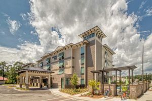
The owner’s intention was to place two completely different concepts, a Springhill Suites by Marriott and a Home2 by Hilton, on this one tract. MRP worked side-by-side with the civil engineers to craft site plans that creatively managed the usage of the property while maximizing value and profitability for each concept.
There were “grandfathered” site conditions that discouraged more robust development until the owner felt the timing was a must. Developing a project on Hilton Head Island (HHI) where “Island Character” transcends all other parameters, provides its own set of challenges but this property had a laundry list of other issues to contend with.
The site was below floodplain level, had high voltage transfer lines with a 50-foot-wide easement, and suffered from extremely low water pressure for fire protection on the proposed four-story building. MRP was also fighting an oppressive height limitation that required every inch of height to be designed with intention.
The Home 2 (H2) hotel was the first concept to be designed. In its standard prototype, Hilton allows for Queen-Queen Rooms, but it is not in the base Hilton drawings as the H2 brand specifically targets the business person on-the-go, providing primarily single queen bed suites.
Since Hilton Head Island is a family destination, the MRP team suggested a considerable segment of the building be expanded to have two beds. This change added 6 feet to the footprint for a particular block of rooms requiring related structural design modifications. As a bonus, the laundry and the food serving areas below, which are almost too narrow in the prototype, also enjoyed this extra space to operate more efficiently.
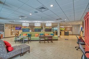
Many fashionable trends, like community tables in the breakfast area and modern conveniences, like Wi-Fi accessibility (“The Connected Room”), were included in the prototype, and are easily mastered by our engineers. Having designed hundreds of hotels, addressing these trends and requirements comes easy for them, leaving us to accent the differences that make the brand stand-out and concentrate on big picture items like local design restrictions in place to keep this resort area beautiful.
Adding conveniences for the traveler is fun, addressing a floodplain can be a much bigger challenge. Obviously, MRP had to raise the finished floor level out of the flood plain, easy enough. But because of the proximity to the coast, we had to incorporate break-away barrier walls to keep the rain out but allow a flood surge in to save the structure during a storm. Underground propane tanks also had to be anchored so they would not float in frequent high water events. 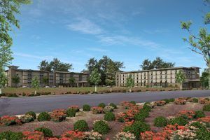
Other storm drainage structures, and water pressure shut off valves that had deteriorated over the years had to be discovered with cameras and pressure tests, and corrected before we could proceed.
Hotels require sprinklers, and sprinklers require minimum pressure. Maintaining that minimum pressure requires fire pumps, and most of the time very expensive emergency generators to run the pumps. Sure, there are ways to bypass the main disconnect, avoiding the generator, if the power is deemed “Reliable”, which it is not on the island. MRP provided creative alternatives to the Fire Marshal avoiding the extra expense, while keeping the property safe.
Speaking of safety, the site is in a very high lightning strike area, which is only exacerbated by the natural lightning rod of the high voltage lines. This was easily addressed with properly placed lightning protection.
Lighting levels are required to be very low on Hilton Head Island. So low, designers had to use special parking lot and pool lighting and careful spacing to meet the national code levels, but not exceed the island character parameters.
Project No. 2 up and ready…
The second hotel, a Marriott Springhill Suites (SHS), had many of the same hurdles as the Home 2 project. Both brands focused on their outdoor spaces, fire-pits, and grilling areas, which fit right into the pedestrian atmosphere in HHI. The building ran parallel and much closer to the power lines requiring us to shuffle the swimming pool from behind the building like the prototype, to the end of the building. The required restrooms and other features were shifted to provide a seamless operation.

Humidity was another factor that brought extra focus to these projects. Marriott requires the toilet exhaust to be replaced with conditioned air, piped all the way to each room, from the roof, forcing the balance of air by using diminishing duct sizes as you go, with certain back-draft dampers, etc.
That ductwork takes up ceiling height that we did not have to spare considering the local height restrictions, requiring flatter/wider ducts with other challenges.
The Home 2 exhaust system is allowed to pump conditioned air into the hall, and have it drawn half the length of the hall and under the doorway, by varying the volume of exhaust in the suites.
There is as much art as there is science to balancing infiltration and other factors. While we were building the Springhill Suites project, the H2 had already developed a moisture issue. A faulty Test and Balance Report had missed the fact that the rooftop toilet exhaust shaft fans had not been set as we required on the drawing, causing a negative pressure and sucking in humidity through the outside walls.
The fans were adjusted and the moisture cleaned up before it became a serious detriment to the building. You might think, if you exhaust enough humid air out of the building you are good, but you can exhaust too much.
The final buildings were so unlike the initial prototypes, with plantation shutters and other beautiful Design Board Review features sprinkled throughout the design, that MRP had to ask two franchisors for special consideration more than once.
In the end, the projects have become flagships for creative alternatives. For example, the H2 prototype “beacon” feature became a more muted lighthouse tower. The trick was giving the local Design Review Board the “feeling” they wanted without losing the hotel branding completely.
Hotels are on the way back after the latest downturn, and the industry is poised to meet the demand.
Tom Morgan is Director of Architecture for MRP. Over the past 31-plus years, MRP has completed more than 2,500 projects across the United States. Its team of NCARB certified architects are specialists in the design and development process, from preliminary interior and exterior layout design through detailed permit and construction drawings to construction administration.


