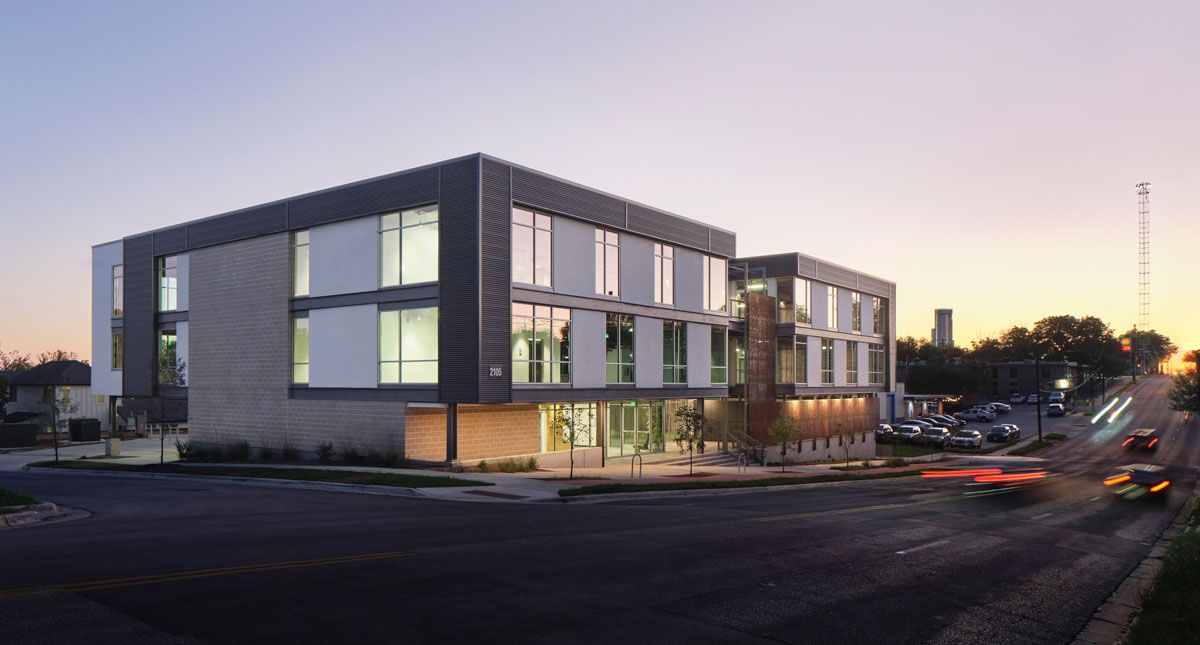
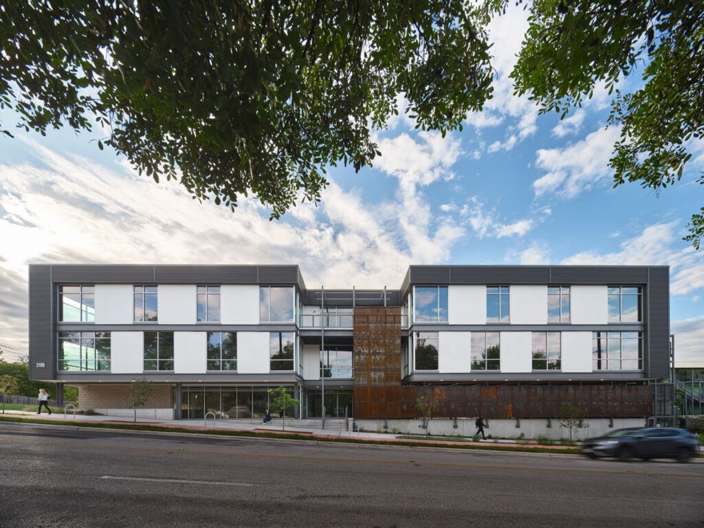
Nestled in a vibrant, walkable area of East Austin on Martin Luther King Jr., Boulevard, steeped in history and local neighborhood amenities, the Ferdinand is a unique structure that is a testament to sustainability and wellness in building design. The office building at Ferdinand Street and Martin Luther King, Jr., Blvd. in Austin, Texas, was something of a design challenge sandwich. We started with some tricky existing site conditions, were then met with a global pandemic, and later faced unexpected site conditions, on top of those present from the start.
But, as a good design team knows, some of the greatest success stories are born of the hurdles you clear.
The initial request from the client was familiar. They asked that we design an office structure that would attract their ideal clientele, make the most of the small site footprint, and keep design within the budget. They relied on our expertise to make the project shine.
 The location itself would prove to be one of the most challenging aspects of the design process. The East Austin neighborhood is a historic area that—like the rest of the city—has been fast-changing. As such, there aren’t many available, easy-to-build-on sites, and this project was no exception. Not only was the site small for what the client hoped to accomplish, but there were also zoning restrictions and traffic considerations. Plus, the location had a grade that ran diagonally across the site, which could complicate parking options.
We began with the top priority: maximize the square footage of available office spaces. We used modeling software to design options that took into account the zoning-required setbacks from the street and building height restrictions (the office is located near a residential area). Our client chose a unique design that features an unusual corner core.
Whereas you would typically find the lobby, circulation and elevator space in the center of the building, this building situates those components in the corner, set in from where MLK Boulevard and Ferdinand Street meet.
This concept can be tricky for a space meant to accommodate more than one tenant. We had to be particularly thoughtful when implementing an efficient circulating path that would get tenants to their suites without needing to travel through another’s space. We also had to consider convenient exits so everyone could safely leave the premises without compromising the other project goals.
Once again, to maximize space, we located the west egress stairs on the exterior of the building so they wouldn’t cut into the floor plate. Located in a bikeable and walkable part of the city, we made a point to consider the space needed for those commuting to the office and leaned into city incentives that allow for reduced parking. We built a level and a half of subgrade parking, in addition to cyclist-friendly amenities such as bike lockers, a bike path and showers.
Bring it on…
But even this set of creative solutions was not without some challenges. Upon digging into the site to build the parking facility and foundation, the team was met with water intrusion. We quickly came up with options for the client, who chose to install a water pump, at which time the team began collaborating directly with the general contractor to adjust the foundation design so it would accommodate the limited area on the site for the contractors to work.
With those literal groundwork solutions in place, we could look upward. The East Austin neighborhood is fairly eclectic, so we didn’t need to conform to a particular “look” to blend in with the neighboring architecture. And as the building doesn’t quite have a true front or back, we were able to address unique facade conditions around the structure without the need to adhere to traditional notions of front- or back-facing elements.
 Because we hold ourselves to certain environmental standards, even if not expressly requested by the client, we created an energy model to guide where to place glazing and to support building functions such as solar heat gain or quality of light. The choices we made here were guided by the best practices of The American Institute of Architects (AIA) Framework for Design Excellence and the WELL Building Standard, which also sets the building apart from similar structures.
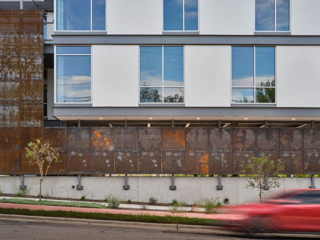
In an effort to be authentic with how we expressed the building’s steel structure, the floor plates are clad in actual steel channels, which make for an interesting horizontal element on each floor of the project. Another interesting metal element is the parking wrap.
Exposed parking garages are not permitted along this particular corridor, so we designed a decorative, perforated metal screen wrap that—while acting as a barrier—also allows for ventilation and light. The site materials we chose have longer lifespans and require minimal maintenance, and we selected many locally sourced materials to support the local economy, workforce and ecology.
Air flow became a much larger concern than we could have anticipated at the start of this project, as COVID-19 began while we were designing the space. We put everything on hold and asked ourselves tough questions about the future of office design. At the time, there was no precedent, no other success stories to compare this project to, and no leading trends for this challenge.
As we took a beat to consider the options, we landed on the need to provide as much space and ventilation for the eventual building tenants as possible. For example, we widened movement spaces such as stairways so people wouldn’t feel crowded as they made their way throughout the building, and we incorporated outdoor areas on each level.
The result of our “design challenge sandwich” was a building that prioritizes occupant health and wellness. There’s a monument stair leading to the building that faces MLK Boulevard, which is lined with plants and dotted with bike racks. You might pause for a moment in the small courtyard as you approach the lobby, perhaps to check your phone or wait for someone before heading inside.
The lobby itself includes a plant wall as another biophilic feature that we added in an effort to bring a little bit of the outside in. Moving through the building, you have the option to take a wide grand staircase and to pop outside on any floor for a breather.
Whether you bike or drive to work, pause near a window or on a balcony, or enter the building at the side of the nearby residences or streetside, the structure encourages movement, flexibility and connection.
Sarah Shearer is a licensed architect and creative designer focused on innovative work in the commercial, retail, hospitality and educational sectors. Currently, She co-leads Cushing Terrell’s architecture studio in Austin, Texas.