For patients of all ages – and their families – a visit to a medical facility can produce feelings of uncertainty and anxiety. Therefore, each touchpoint along the way matters. It is the careful attention to detail when planning the design of a healthcare facility that can help to establish an optimistic work environment for employees, and create a soothing atmosphere that supports patient wellness and boosts confidence in the capabilities of the clinicians delivering expert care.
The design of modern healthcare facilities continues to advance, shifting from the sterile and monotonous institutions of 50 years ago to today’s warm and welcoming structures intentionally tailored to the communities they serve. By incorporating durable and sustainable ALUCOBOND into their designs, whether interior or exterior, its robust array of brilliant colors and rich finishes, allow architects to create eye-catching projects across the U.S. that stand out and make a positive impression.
3A Composites is committed to the design, production and delivery of sustainable, high-quality, beautiful materials that inspire customization and creativity in the healthcare market. With 91 ALUCOBOND PLUS standard finish options, and nearly unlimited custom colors, we’re helping the architectural community give shape to their great ideas.
DAYTON CHILDREN’S SPECIALTY CARE CENTER
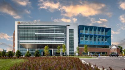
Each year, Dayton Children’s Hospital sees more than 300,000 patients. In March 2023 the healthcare system expanded its footprint in southwest Ohio, opening its Specialty Care Center
just steps away from the main hospital.
The exterior design of the new five-story,152,000-square-foot facility proudly bears the iconic look and signature style created for all Dayton Children’s medical facilities. Selected for its rich
tones, Dayton Children’s Blue – a custom ALUCOBOND PLUS finish – features vibrant color-shifting elements that deliver shades of blue and green, depending on the lighting and time
of day. Wide sections of faceted panels, allow observers to experience the full spectrum of color shifts as they move around the building, creating a dynamic and stunning appearance.
Just a few years before the Specialty Care Center was completed, an eight-story patient tower opened at the center of Dayton Children’s main campus. During construction of the
tower, the healthcare system also underwent a rebranding with the goal of creating a distinctive, yet playful, look. The building, positioned along Rt. 4 — a main thoroughfare in Dayton —
would be highly visible to drivers and therefore presented an opportunity to establish a strong regional presence.
To ensure they would meet their objectives, during construction Dayton Children’s leadership sanctioned a study on the visual interest of the building. As part of this, they ordered the fabrication and installation of a full-sized mock-up of an ALUCOBOND PLUS Dayton Children’s Blue panel. Then, as a team, the senior leadership held a unique meeting. Together in one vehicle, they drove back and forth on Rt. 4 to evaluate first-hand the future look of the Dayton Children’s brand. The choice was clear and the decision was overwhelmingly in favor of the eye-catching custom color, and faceted design, that is now known as Dayton Children’s Blue.
Feature Image Courtesy of 3A Composites


